Honestly, I’d always loved those Mucha posters but never tried painting like that myself. Figured it was way too fancy and complicated for me. But yesterday, YouTube kept pushing tutorials at me, so I finally cracked and thought, “Eh, screw it, let’s try copying one.” Grabbed my sketchbook first thing this morning.
Starting with Pencils and Pure Confusion
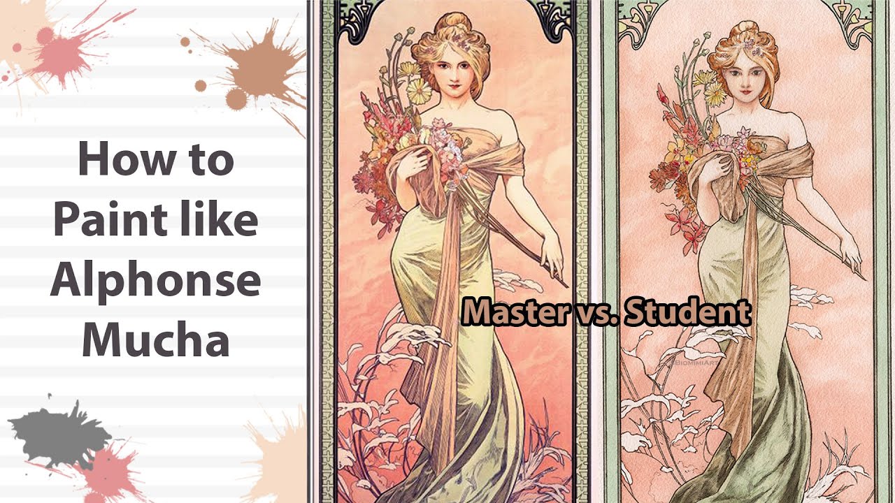
Opened up my browser to a random Mucha lady picture. Seriously stared at it for like ten minutes straight. Noticed things I’d totally missed before. Like, her hair wasn’t just hair – it was these huge, whippy swirls curling around her head and shoulders, almost like fancy smoke. And the background? Swirly lines and flowers everywhere, framing her like a fancy oval picture frame. Felt pretty dumb realizing how important that framing was.
Sketching this out went sideways fast. My first try looked like a potato person someone dropped on a doodle pad. Erased it hard when I saw how stiff everything was. Second try, I ignored trying to make a perfect face right away and just drew giant swirling lines to map out where the hair flow should go, like tracing imaginary storm paths on paper. Way looser, way messier pencil marks, but already feeling more ‘Mucha-like’.
- Messy Swirl Phase: Scribbled big looping lines for hair paths
- Floral Border Fumble: Roughly blocked oval shape with super simple flower shapes along the edge
- Basic Lady Outline: Finally sketched a super simple face and shoulders inside the swirl mess
Inking Disaster Turned Lesson
Grabbed my cheapo fineliners. Big mistake number one? Using the same thin line for everything. Looked super flat and boring. Looked back at the Mucha image on screen. His lines? Magic. Thick and thin constantly changing, especially around the hair swirls – thick on the outer curves, super thin on the tight ones. Practiced just drawing spirals on scrap paper, pressing hard then light to mimic it. Took ages just to get kinda okay at it.
Then came coloring with my old watercolor pans. Thought “pretty pastels” meant grabbing my lightest blues and pinks. Wrong again. My first layer looked washed out like faded jeans. Peered closer at the Mucha picture. Even the soft colors had actual richness to them. Mixed slightly stronger versions on my palette. Built up layers super gentle, focusing light on the face and hair highlights. Background? Added pale greens and golds like his, but oh man, keeping it light enough felt like walking a tightrope.
The Grand Finale (Kinda Sloppy)
Added the finishing touches late afternoon. Tried mimicking his signature ornamentation – tiny flowers in the hair, details on her dress. Mine looked like clumsy blobs. Scaled way back to just a few simple dots and dashes. Signed it feeling kinda beat but also proud? It definitely shouts “Mucha wannabe done by a rookie,” but you can see the swirls and the color vibe for sure.
What smacked me in the face after today? Mucha’s style looks effortless but is sneaky hard. Getting those flowy lines right changes everything. The soft-but-not-wimpy colors matter tons. And that circular frame wrapping the figure? Way more important than I ever gave it credit for. My version’s messy, but honestly, staring at his work while struggling to copy taught me more than just looking ever did. Might butcher another one next week.