
How I Got Schooled By Ultramarine Blue
So, picture this. I’m sitting in my little studio, covered in more paint than the canvas, trying to mix this perfect ocean blue for a stupid beach scene. Kept mixing my regular blues with white, maybe a touch of green… and bam, it just looked flat and lifeless. Like dishwater pretending to be the sea. Frustrating as heck. Scrolled through some photos later for inspiration and kept seeing this one stunning, rich blue popping up in all kinds of old paintings and fancy ceramics. People were calling it Ultramarine. Okay, sounds fancy. What even is that?
Googled it quick, obviously. Saw it was like this ancient, super expensive blue made from crushed up rocks way back when. Like, cost more than gold kind of expensive. That blew my mind. I knew my cheapo student-grade tubes weren’t gonna cut it for that vibe. Figured, screw it, time to see what the fuss was about.
Walked down to the art supply shop – the proper one, not the bargain bin. Saw two tubes labeled “Ultramarine”. One was “Ultramarine Blue,” the other was “Ultramarine Blue Hue.” Price difference was… noticeable. My wallet screamed “Buy the Hue!”, so I grabbed that one first. Got it home, squirted it out. Nice blue. But… intense? Maybe a bit too electric. Compared it to some pictures online on my phone. Nah, the real deal stuff in the old paintings looked deeper, a bit warmer, almost violet-ish? This Hue stuff was cool and bright. Pretty, but not quite right. Whole afternoon down the drain messing with it.
Next day, swallowed hard, marched back to the shop, and actually bought the real Ultramarine Blue. The pricier one. Felt the pain instantly. Got home, squeezed out a pea-sized blob. Now that was different.
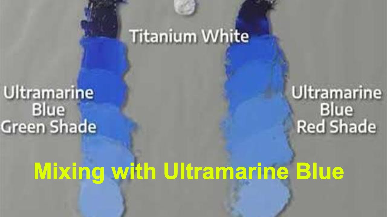
This stuff felt richer, straight outta the tube. Held up the tube from yesterday next to it. Night and day.
- The Ultramarine Hue? Very bright, almost like royal blue. Kinda fake next to the real thing.
- The genuine Ultramarine? Deep, complex, with this definite hint of violet inside the blue. Just… richer. Like expensive velvet compared to polyester.
Tried mixing them like before for my ocean. Just a bit of the real Ultramarine with white? Boom. Suddenly had that luminous, deep quality I was missing before. Like sunlight hitting deep water. Way less plastic-looking. Then, got cocky, tried mixing it with a tiny touch of crimson (remembering that violet hint). Completely messed it up! Went straight to muddy purple sludge. Lesson learned: respect the Ultramarine. Handle with care!
So yeah, that’s my adventure. Learned real quick:
- Ultramarine is a specific, gorgeous blue with a wild history.
- “Hue” means cheap imitation – save it for when you really can’t afford the real deal.
- The genuine pigment has this unique warmth inside the cool blue you gotta see in person.
- It mixes beautifully… unless you get greedy. Go easy on mixing unless you want mud!
Totally worth the price jump for the real stuff when you want that specific magic. My ocean scene finally looks happy. Mostly happy. Still kinda looks like a toddler did it, but with fancier blue.

